
Miscellaneous Projects
Branding/identity, packaging, publication—a smattering of the many other types of work I’ve done that didn’t fit neatly into another larger category.
The Cookie Fish
A charming, hand-drawn logo for a tiny cookie business—with an equally charming backstory.
The Cookie Fish logo.
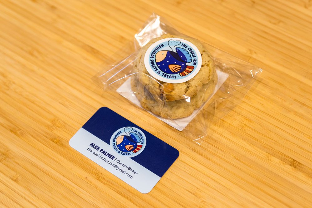
The logo in context - on a cookie package, and on a business card.

The ingredient label on the back needed to be flexible enough to accommodate new labels for new recipes on a nearly weekly basis.

The pricing and payment information card that would be displayed next to the cookie display.

The original logo sketch.

A reference photo of the brand's namesake, a ceramic cookie jar shaped like a fish.
The Story (and Design Process)
This project was a unique opportunity to develop a brand truly from scratch, as I came to it before the business even had a name! I was able to use my branding know-how to guide the client’s brainstorming process toward a direction that felt right for them, and eventually they settled on an identity that would honor the origins of their love of baking: their late mother, who used to bake cookies every week and store them in a unique ceramic cookie jar shaped like a fish. Hence, The Cookie Fish!
Everything came together fairly quickly after that—the client wanted to lean into the quirkiness of the source material with a friendly, “homemade” vibe for the brand, so I simply illustrated our fishy friend (with some minor modifications to make it more logo-y) and built a logo around that.
Rosewater Creative
A charming, hand-drawn logo for a tiny cookie business—with an equally charming backstory.
The Cookie Fish logo.
The logo in context - on a cookie package, and on a business card.
The ingredient label on the back needed to be flexible enough to accommodate new labels for new recipes on a nearly weekly basis.
The pricing and payment information card that would be displayed next to the cookie display.
The original logo sketch.
A reference photo of the brand's namesake, a ceramic cookie jar shaped like a fish.
The Story (and Design Process)
This project was a unique opportunity to develop a brand truly from scratch, as I came to it before the business even had a name! I was able to use my branding know-how to guide the client’s brainstorming process toward a direction that felt right for them, and eventually they settled on an identity that would honor the origins of their love of baking: their late mother, who used to bake cookies every week and store them in a unique ceramic cookie jar shaped like a fish. Hence, The Cookie Fish!
Everything came together fairly quickly after that—the client wanted to lean into the quirkiness of the source material with a friendly, “homemade” vibe for the brand, so I simply illustrated our fishy friend (with some minor modifications to make it more logo-y) and built a logo around that.